Building excitement for the club-collaboration charity fundraiser quiz of the year!
Clients
A collaboration of: The New Zealand Alpine Club, Victoria University of Wellington Tramping Club, Wellington Tramping and Mountaineering Club and The Tararua Tramping Club.
Project
Quiz marketing campaign
Service
Graphic Design, Illustration

Last year something exciting started, a collaboration between two Wellington outdoor clubs to host a quiz fundraiser for local charities. The event was so successful we’ve decided to double the scale, inviting two additional clubs to participate and requiring a full marketing campaign to build anticipation.
The Mission
With almost double the number of tickets we aim to sell, ensuring they sell-out so we raise enough money for our chosen charities is a must. As the only designer in the volunteer quiz committee, I raised my hand to create something that both fairly represents all clubs involved and builds excitement and anticipation in the lead-up to ticket sales.
The Solution
With so many clubs involved, we had many avenues of communication to our audience through various newsletters, community chats and club social media pages. The goal was to create something that could be adapted to all these different channels while still being cohesive. A plan for a full suite of collateral for both print and digital media was required.
The Execution
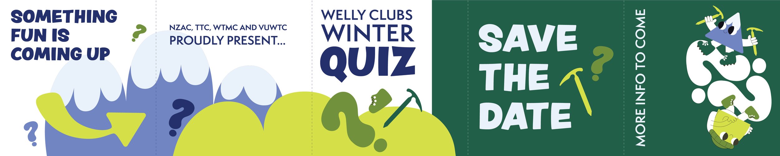
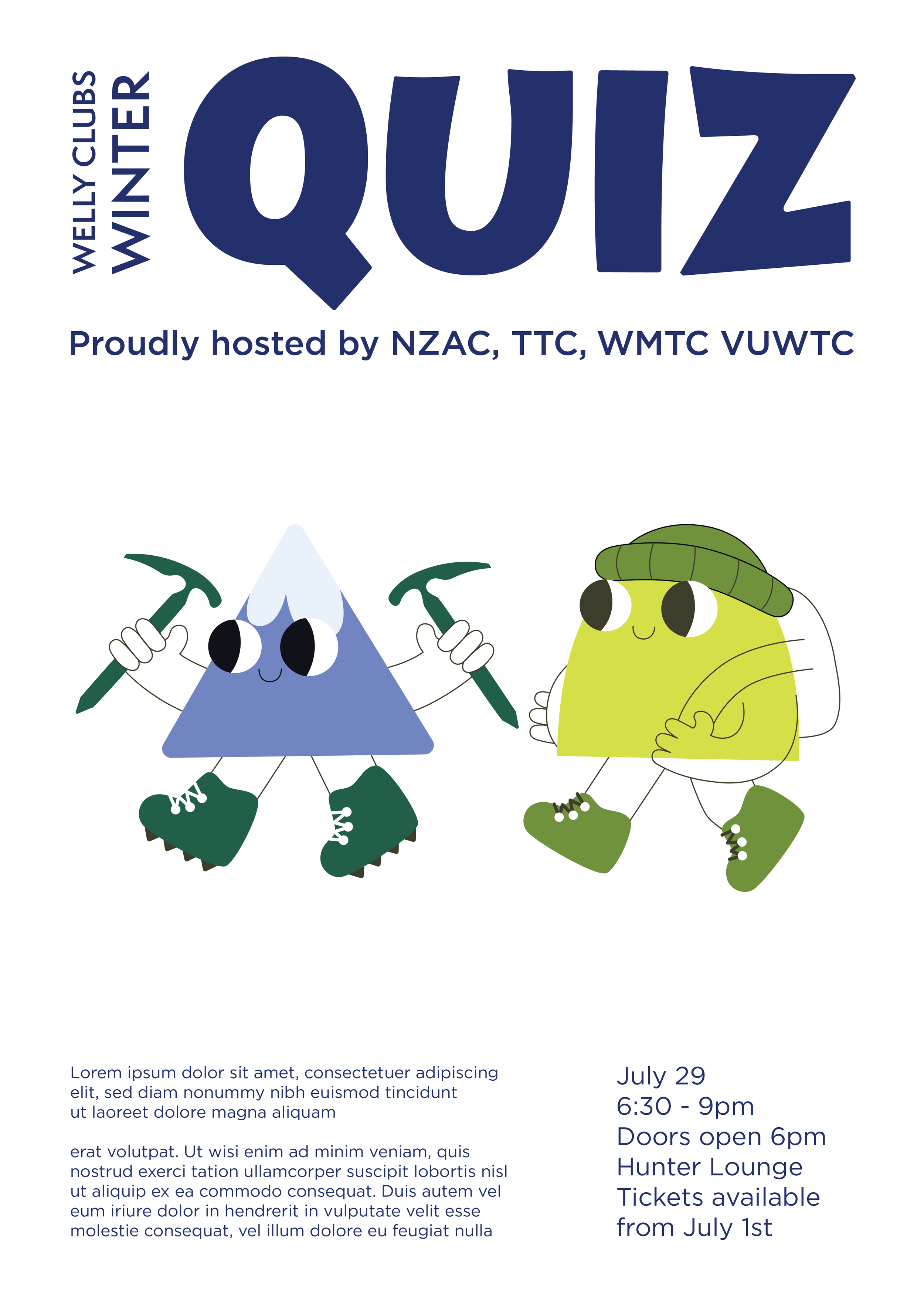
In order to fairly represent all the clubs involved while still creating something new, I decided to have some fun with using elements from each clubs’ logo and main activities.
Colour: I adapted a colour palette by taking a main colour from each logo and making shades from some colours where necessary. Happily, as we’re all outdoor clubs this created a nice palette of mostly greens with a dark blue to create contrast. The palette was unique to us, striking and memorable.
Typefaces: For the main typeface, what I really wanted to communicate was a sense of fun and whimsy. Last year’s quiz was highly rated as a hilarious and wholesome event, a feeling I wanted to convey though this year’s marketing. I went with Peachy Keen as our title font, a whimsical yet bold typeface with fun and varied characters. For the body font, I opted for a rounded sans-serif to compliment the title font. The wide shapes and clear lettering allows for ease of reading on both digital and print material while looking cohesive with Peachy Keen.
Elements: As all clubs do some variations of tramping and/or mountaineering, the obvious elements to include were hills and mountains. After playing around with other ways to make this feel more playful and eye-catching, I decided to include mascots. Introducing Hillary Hill and Monty Mountain. Both adorned with some appropriate attire (our clubs are about safety first!), the two characters can be moved around and adapted to various positions and compositions. Additionally, the use of question marks in the colour palette carefully placed around the designs tells the user at a glance: this is a quiz, related to tramping and mountaineering, and it looks fun!
The Result
Upon presenting all four clubs with the design proposal, it was a resounding and unanimous approval for the designs. We have a fun selection of fonts and elements that can be easily moved around and adapted to different sizes and compositions for marketing across all channels.